I thought it would be a fun exercise to look at the ballcaps that MLB Teams wear during the regular season and rank my Top-5 hats. Mind you, I’m not talking about all of the alternate/holiday/special event hats that teams pull out throughout the year, rather, the hats that they wear on an everyday basis during the year.
Number 5: Boston Red Sox
The Red Sox have stuck with the navy blue cap emblazoned with the bold and ornate “B” on the front of the cap essentially since their debut in the MLB. While they did have a short stint of red caps with a navy blue “B” from 1975-78, the cap has essentially remained unchanged. The cap has a classic look and feel to it and it’s been worn by the likes of Ted Williams, Carl Yastrzemski and Bobby Doerr.
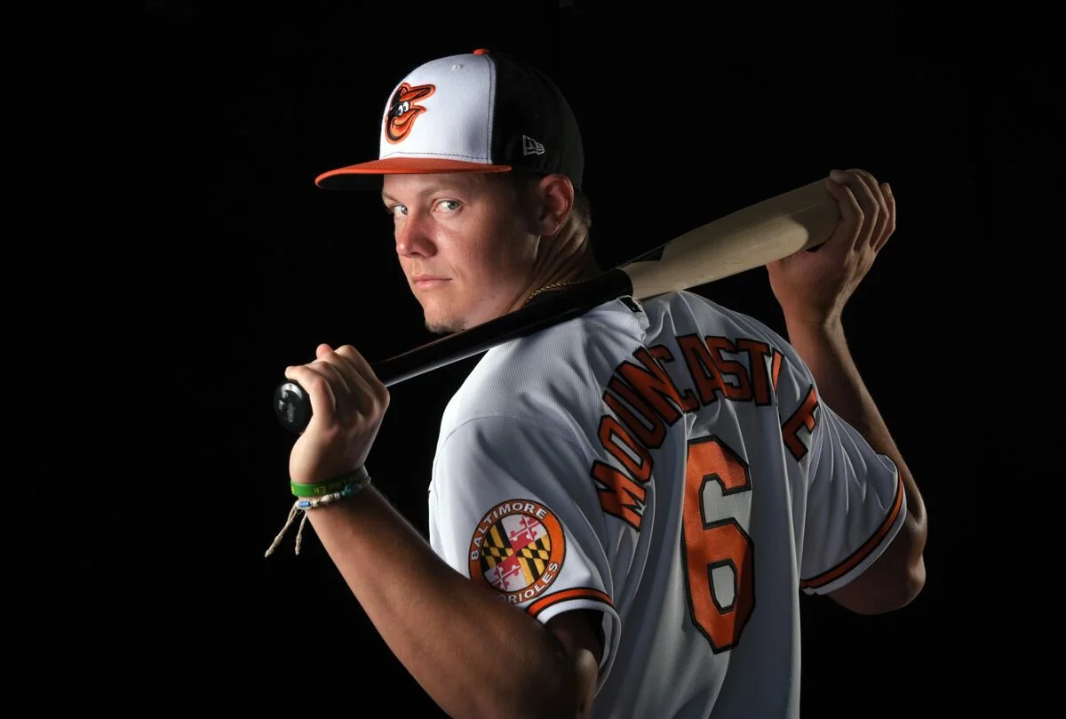
Number 4: Baltimore Orioles
The cartoon bird is simply FUN! The team revitalized and re-envisioned their caps back in 2012 when they modernized the original cartoon bird to what it is today. With the orange, black and white color scheme of the teams uniforms the tri-color approach with the hat was executed flawlessly and the cartoon front and center on the hats is perfect!
Number 3: Milwaukee Brewers
The original ball and mitt logo was a mainstay on the Brewers uniforms from 1978-93. Unfortunately, from 1994-2019 the ball and mitt logo was eliminated from the uniforms completely. November 18th, 2019 rolled around and the organization had an unveiling of new uniforms on which they slightly modernized the old ball and mitt logo by swapping out metallic gold for mustard gold while keep the navy blue intact. How can you not love that logo?!?! Not only is it a baseball in a mitt it is also a “M” (the fingers of the mitt) and “B” (the ball and thumb of the mitt) to represent both the city name and nickname of the team! BRILLIANT!
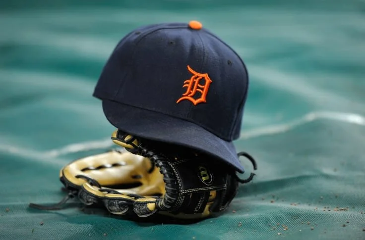
Number 2: Detroit Tigers
The Detroit Tigers have had some version of the letter “D” on their had as early as 1905; a majority of which have been one style or another of Old English. With their current cap style Detroit has been able to manage the ability to interchange their primary home white with the secondary road orange without issue. The hat has a classic look and classic design that can withstand the sands of time. Greats like Miguel Cabrera and Magglio Ordonez wore hats with the same design as Hall of Fame players like Al Kaline and Alan Trammel.
Number 1: New York Yankees.
Despite being a Yankees hater, I cannot deny that the New York Yankees have one of the most recognizable logos on their ballcaps in the nation, if not the world. The interlocking “NY” has been around since the organization was started. While they’ve seen some changes to their uniforms the Yanks have never sought to change the logo on the cap. Think about the history behind this logo…..Joe Dimaggio, Babe Ruth, Derek Jeter, Mariano Rivera and so many more. It is hard to deny the longevity and iconic nature of the logo!
What do you think? Do you think another cap should be in the Top-5? Should any of these 5 I’ve listed not be where they are? Would you switch the order around? What are your Top-5?


